Course Scheduling Tool Project
I was first introduced to user experience during my coursework at Ohio State while studying New Media and Human-Computer Interaction. During my coursework, I worked on UX project to improve the current course scheduling tool.
This design’s goal was to allow students to add their next semester courses, while also letting them to see what courses they’ve already completed & what other course requirements were still needed.
The Problem State
As a user myself, I noticed the existing tool had several limitations and unoptimized features that caused friction for users.
After also interviewing other current user, here are the core problems that I focused on improving:
The existing system did not allow users to simultaneously review your degree requirements within the same interface. It was a rather manual process that was done separately.
Users had to click into a separate page to view robust course details, disrupting the flow of their class search
The system would not remember users’ recent searches, requiring users to scroll through options alphabetically repeatedly.
Below is the existing interface after a user has entered in a course search
Ideation
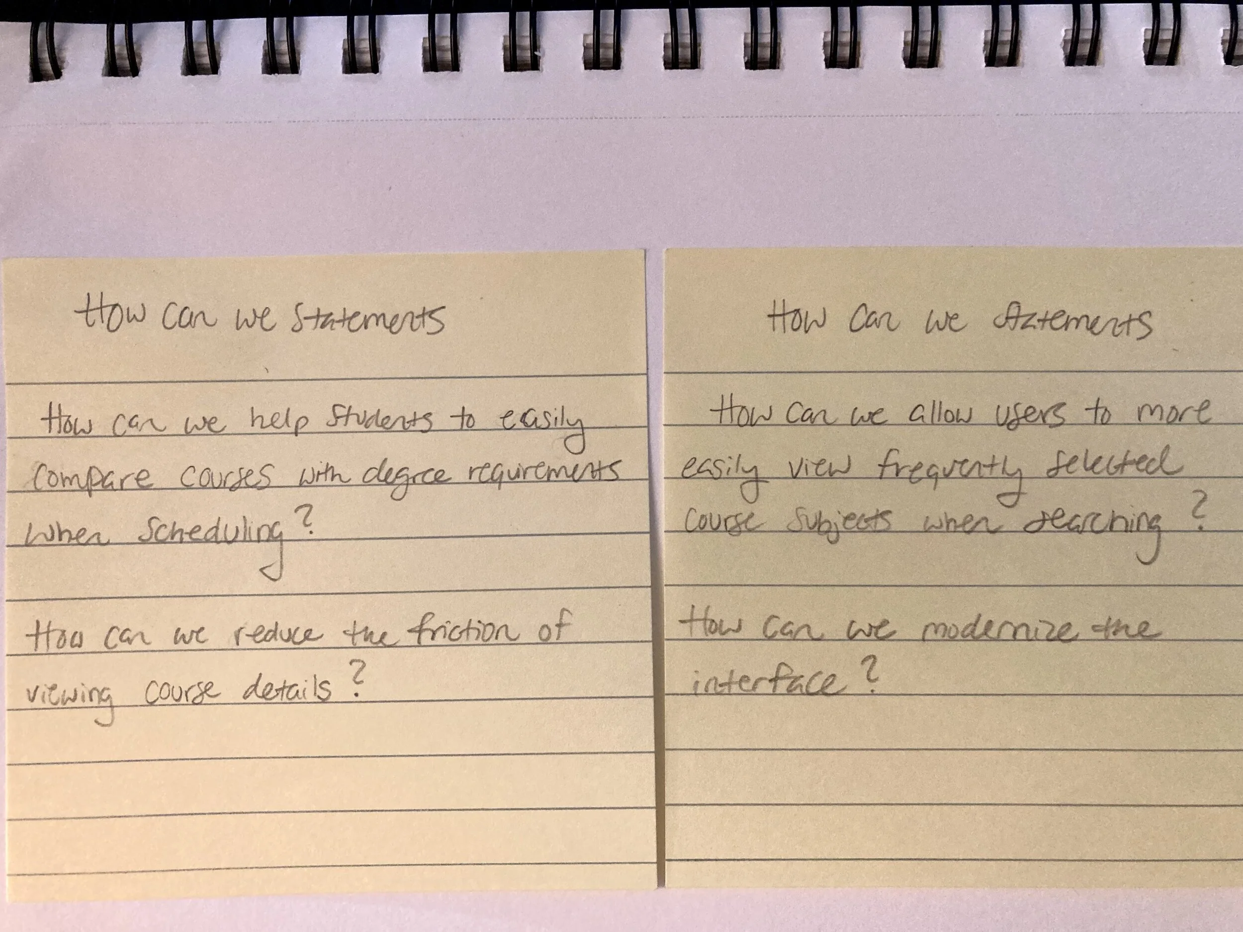
To map out potential solutions to these problems, I developed some “How Might We” statements and drew up solution ideas.

How Can/Might We Statements to focus in on what problem to focus on

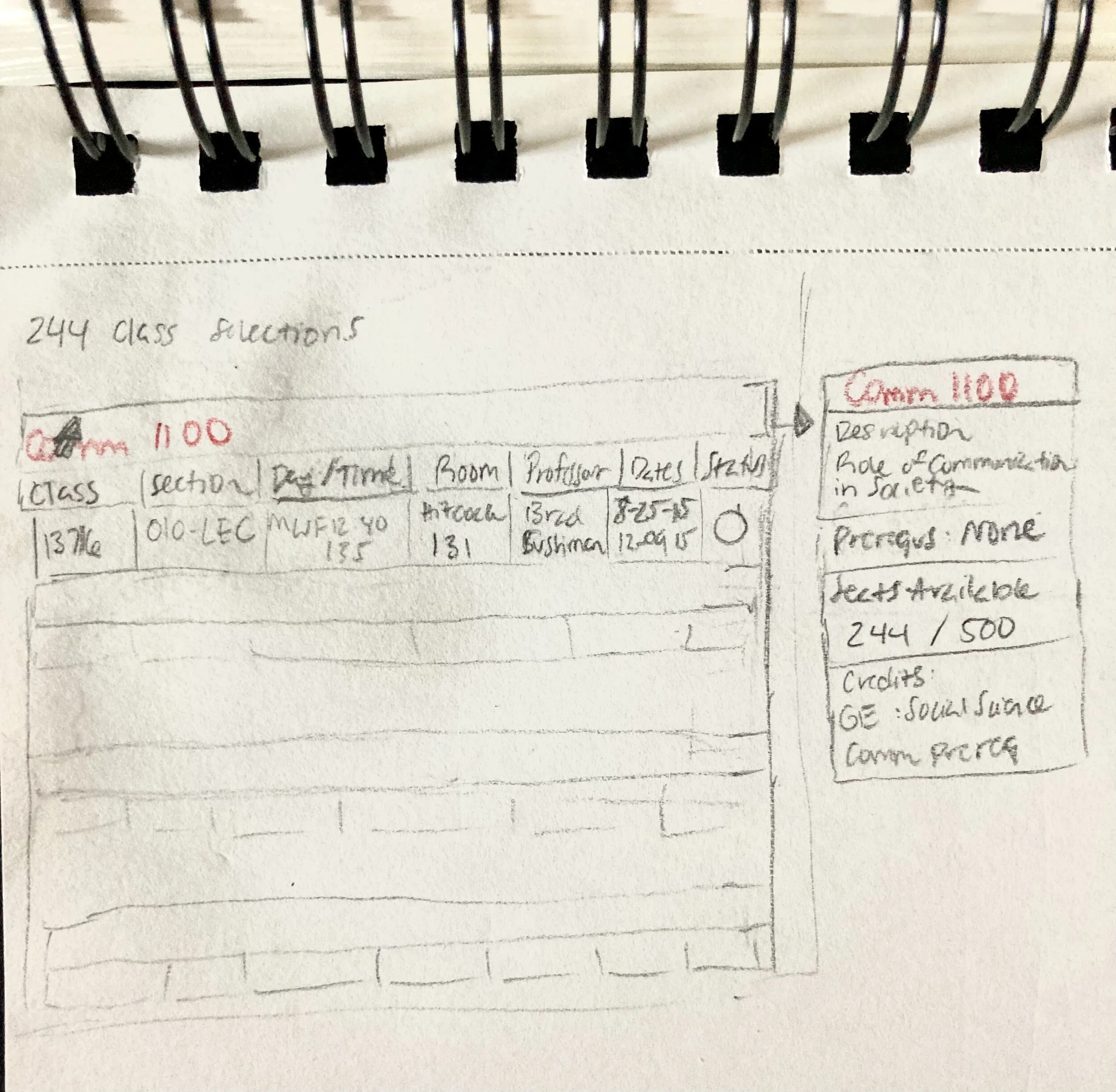
Hover feature to view more course details without leaving the search page

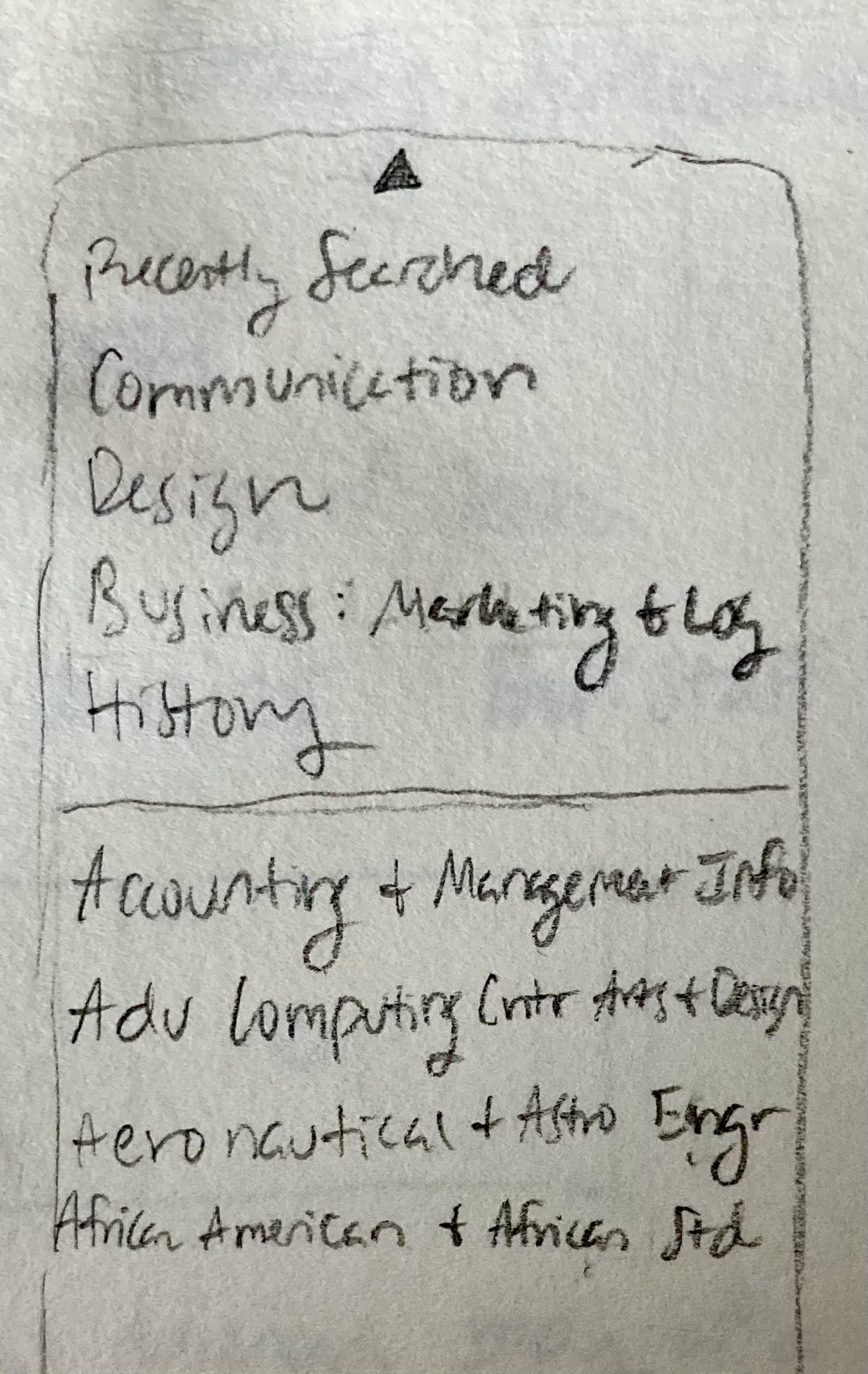
Recently viewed subjects placed above default alphabetic list, reducing the need to scroll for recently selected subject every search

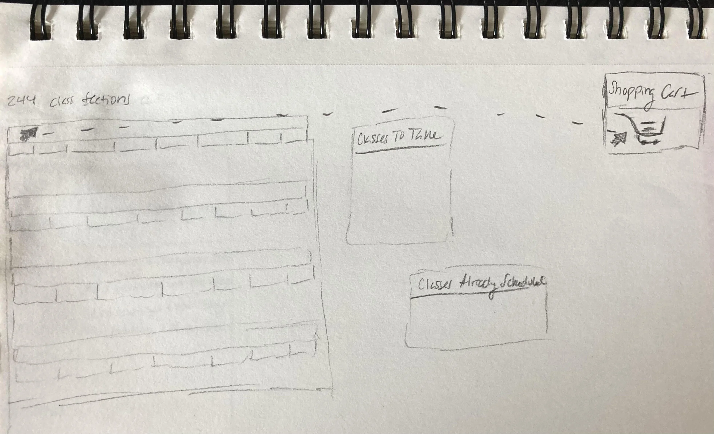
Shopping cart feature to a sense of familiarity and modernity to the interface
Solutions
My solution revolved around:
Providing users with additional features to more easily assess what courses are still needed for their degree requirements.
As well as adding improved feedback interactions that incorporate dynamic hover and tap states for course addition options.

