Walmart Baby Registry Experience
As a product design strategist for Walmart’s Baby Registry experience. I collaborated cross-functionally with product, UX & marketing to transform the platform into a versatile, recommendation-based product that allows registrants freedom to curate their registry.
This redesign was driven by consumer research, which showed that registrants wanted more levels control over their registry.
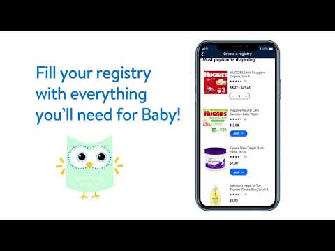
Here is a video showcasing the experience. Please scroll through to see the entire flow of the registry experience!
Setting the Scene
The Overview
Walmart set to redesign their registry experience in 3 months
In the prior registry experience, merchandise was auto-populated into registries based on gender & themes. It was created with 1st time parents in mind. 74% of expecting parents create multiple registries across different sites. Then narrow it down to 1-2 “primary” ones.
This design was not meeting user’s needs, thus not being a top contender for becoming a primary registry. This caused a failure to achieve adequate business results because gift givers didn’t purchase off the registry, likely because registrants only shared their primary registries with them.
The Problem
Customer engagement & primary registry consideration were lacking.
Due to the auto-populated basis of the experience, users were not guided to curate their registry to their liking as much. This lead to a lack in user interest & engagement, since a lot of the items were already.
Engagement was measured using “make public”, “share” & “editing” actions that users took. Here are the pre-redesign metrics:
Only 50% were edited
Only 28% were made public
Only 47% were shared
The Research
We found parents wanted more autonomy over their registry.
Considering Walmart’s scope, we wanted to redesign the experience for every type of parent, versus to just 1st time moms.
Main findings that drove our strategy:
43% wanted some merchandise recommendation, 44% wanted none & only 13% preferred a lot. Meaning 87% wanted more autonomy.
Additionally, gender wasn’t ranked as top topics for a personalized registry.
Registrants found it easier to add items vs. deleting pre-populated list.
The Role
Product Design Strategist
My role involved a variety of responsibilities:
Cross-collaboration with involved teams (product, UX, creative, marketing & merchandising).
Strategizing the user flow hierarchy. (For examples: the number of steps in the creation process, the departments featured in the different steps of the flow).
Conducting competitive UX research to identify areas of innovation & improvement.
Creating web pages to introduce users to the experience, as well as prompt them to curate their registry.
Working with the merchandising team to curate items to be recommended to registrants throughout the experience.
Advocating for the user’s needs throughout the design process, pulling from out user research & competitive analysis insights.
Orchestrated user testing sessions
The Solution
A versatile registry experience for every parent
Given the scope of Walmart’s customer base (90% of America) & what we learned from customer research, we set out to create a flexible experience that gave users options during the experience to build it the way that they saw fit, whether they wanted a lot of help with selecting item, some, or none at all. I
Main improvements:
Simplified & numbered the steps in the creation process
Introduced an optional step in creation to allow users to select whether of not they’d like some recommendations at that time.
Removed the auto-populated feature from the experience to allow users to curate & engage with the product.
Utilized an existing tool to dynamically bucket added items into their corresponding department
Provided users a second opportunity to view recommended items once they got to the logged-in experience (post creation).
Added a benefits banner to the top of the experience to remind users of the products perks, as well as direct them to an inspirational page to help curate their registry.
The Results
Improvements seen in engagement & revenue
Key results:
Each of the engagement metrics had a goal of a 10% increase from the prior product.
70% of registrants edited (+20%)
44% were made public (+16%)
55% were shared (+8%)
Additionally, we saw a 17% increase in gift giver registry views, thus leading to more purchasing power. YoY results:
12% increase in revenue
21% increase in units sold
2% increase in purchase conversion
25% increase in NPS score
Some hurdles still needed to be cleared that were beyond the scope of our team:
Competitive perks - Walmart’s “Everyday Low Price” motto made it difficult to get leadership to agree to perks offered by competitors that involved discounts.
Acquisition spend - An exorbitant amount of money was spent on acquisition spend in the prior experience & there was not agreement among leadership to reinvest.
The Process Flow:
Step 1/4: Baby Registry Landing Page
The page’s purpose is to showcase benefits & perks to future registrants to encourage them to create a registry. The page also features ideas for gift givers toward the bottom . It’s available on the web experience (mobile & desktop). The options to create/manage & find a registry follow the user down the page as they scroll for seamless accessibility.
Key result:
After implementing this new page design, there was a 4% exit rate decrease - meaning more customers were finding what they needed.
Step 2/4: Registry Creation Process
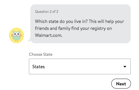
The below slideshow shows the creation flow. The user is guided through the chatbot process with the help of Hoo the Owl, the registry assistant. Users are asked an easy 2 questions (slimmed down from 5 questions in the previous version) to create their registry (it’s created after the state question is answered). An optional recommendation section at the end allows users to view some products, from 5 low consideration departments, to easily start off their registry. The more items the user adds to their registry, the more invested they become in it, consumer research shows.
Key results:
After shortening the creation process, there was a 2% increase in creation conversion seen across all platforms.
52% of registrants engaged with the optional merchandise recommendation function
A majority (66%) of users engaged with 3+ departments during the creation process.
Step 3/4: Logged-in Experience
This interface is shown once the user creates their registry. It includes 9 departments, expanded from the 5 shown during creation, and includes additional high consideration sections, like Nursery & Décor. This enables registrants to view merchandise & experience the dynamic sorting feature when merchandise is added to the registry.
A “benefits banner” was added to the experience to quickly call out perks to registrants. It also linked to our benefits & inspiration page.
Key result:
70% of users added item recommendations when selecting the “Add Items” button. 30% engaged with the “Shop All” option
Fun fact: The feeding category was placed 1st within the experience to align with our consumer research finding that expecting parents were most interested in what feeding options were available from the retailer & that’s also reasoning behind why it’s incorporated as a merchandise recommendation for both the creation chatbot & the logged-in experience.
When users click into the “Add items” buttons next to the 9 categories, a box like the below appears to show them an expanded list of recommendations. The product recommendations are easily edited by the merchandising team through curated shelves. A prompt to “Shop all” in that category was added to the bottom, in case users didn’t want to interact with recommended products listed and wanted to view a broader assortment.
Step 4/4: Benefit & Inspiration Page
Registrants access this informational page through the benefits banner in the logged-in experience above. It reminds registrants of the Walmart Baby Registry perks & tools while also showcasing new tips & inspiration.
Key result:
The page had a 50% entry rate - meaning 50% of registrants viewed & interacted with the page - raking in 250,000 views.


